Page Last Updated on 2026-04-30
The Statistics screen in BPTrakr allows you to view average blood pressure, pulse rate, and other health metrics over a selected date range. These charts help you quickly understand trends and averages without reviewing individual entries. For more detailed trends, see the Graphs screen.
The statistics charts in BPTrakr
The Statistics screen includes the following charts:
- Average Blood Pressure and Pulse Rate
- Average Blood Pressure (AM vs PM)
- Average MAP (Mean Arterial Pressure)
- Average PP (Pulse Pressure)
- Body Mass Index (BMI)
You can also include these statistics in your reports (Pro Edition).
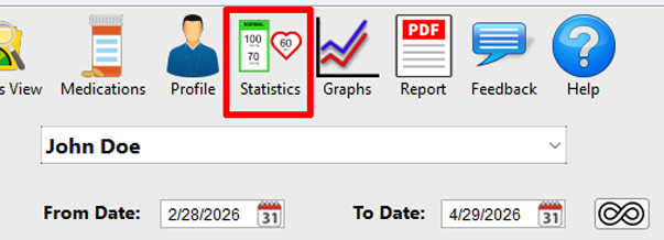
Accessing the statistics charts
Click on the Statistics button to go to the Statistics screen. Use the From and To date fields, or select All Data, to adjust the time period for all statistics. Select a chart using the icons on the right side of the Statistics screen.
Tip: Try different date ranges (such as the last 30 days or 3 months) to better understand trends in your readings.
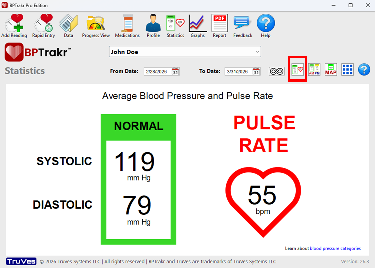
Average Blood Pressure and Pulse Rate
This section displays your overall average blood pressure and pulse rate for the selected date range.
It includes:
- Average Systolic and Diastolic blood pressure
- Average Pulse Rate
- A color-coded category based on your average blood pressure
This provides a quick overview of your general blood pressure level.
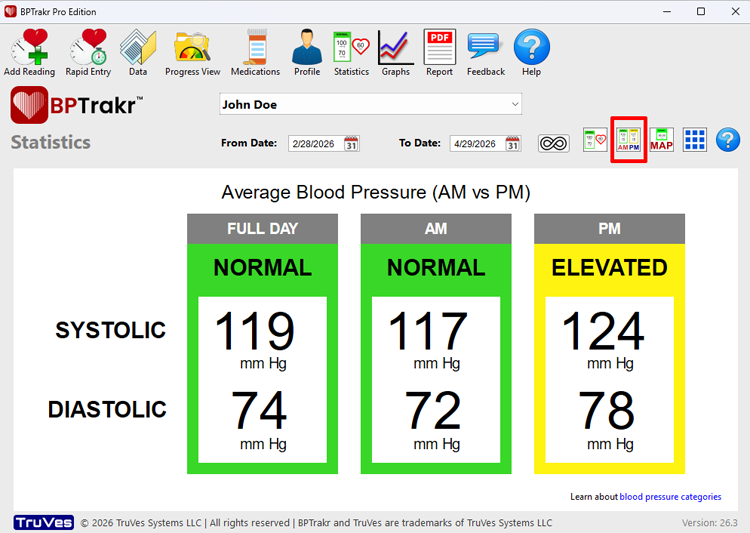
Average Blood Pressure (AM vs PM)
New for Version 26.3
This chart allows you to view your average blood pressure based on the time of day.
Your readings are grouped into:
- Full Day – all readings in the selected date range
- AM – readings taken before 12:00 PM
- PM – readings taken at or after 12:00 PM
Each section displays:
- Average Systolic and Diastolic values
- A color-coded category based on the average blood pressure
This makes it easy to compare how your blood pressure varies between morning and afternoon readings.
If there are no readings for a time period, “No Data” will be displayed.
You can also include this chart in your reports (Pro Edition).
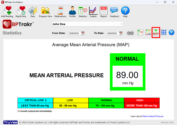
Average MAP (Mean Arterial Pressure)
This section displays your average Mean Arterial Pressure (MAP) for the selected date range.
MAP is calculated using your systolic and diastolic values and represents the average pressure in your arteries during a single heartbeat.
A color-coded category is shown to help interpret your results.
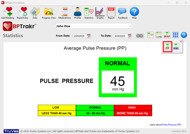
Average PP (Pulse Pressure)
This section shows your average Pulse Pressure (PP), which is the difference between your systolic and diastolic readings.
Pulse Pressure can provide additional insight into cardiovascular health. Learn more about Pulse Pressure.
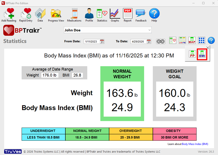
Body Mass Index (BMI)
This section displays your current Body Mass Index (BMI) based on your most recent weight entry.
Your height must be entered on the Profile screen in order to calculate your BMI.
A category label (such as Normal, Overweight, or Obese) is shown to help interpret your results.
The Average of Date Range values provide a summary of your average weight and BMI over the selected date range.
The large values represent your most recent measurement, while the Average of Date Range shows overall trends.
See Also
-
How to Create, View and Print a Blood Pressure Report containing statistics charts
- Using the Dates With Data Calendar.
Comments / Questions